As mentioned in Topic 1, charts are such a vital aspect of technical analysis that chartist has become a synonym for technical analyst. In this segment, we will take a quick look at three different types of charts that you will undoubtedly encounter as you delve deeper into the field of technical analysis: the line chart, the bar chart and the candlestick chart.
The line chart
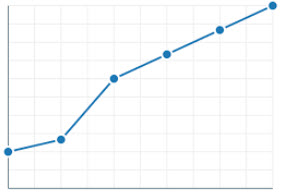 A line chart displays information as a series of data points called markers, connected by straight line segments. The line chart differs from a scatter plot by having its measurement points ordered, typically by their x-axis value, and joined by the straight line segments.
The line chart is a very commonly used chart type, and not just within the field of stock trading and technical analysis. When one needs to visualize a trend in data over intervals of time, the line chart is a convenient choice. (A line chart used for this purpose is known as a run chart.)
For a technical analyst, the line chart is a great way of displaying price movements over time and visualize the trends. Line charts can be created for any time period; it doesn’t matter if you want to see a share’s price movements for this morning’s trading session or for a few decades.
It is important to take into account that the number of markers used will impact the line chart. For instance, if you make a 14-day line chart based on the daily closing price of a share for 14 consecutive trading days, you will not be able to see the price movements that has taken place within each trading day. Certain interesting patterns – such as the share price being highly volatile within each trading day but settling at roughly the same closing price each day – will go unnoticed.
Bar chart
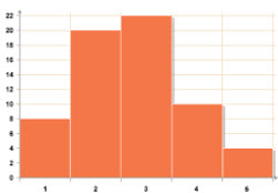 A bar chart presents grouped data with rectangular bars, where the length of each bar is proportional to the value it represent. A bar chart can have vertical or horizontal bars. If the bars are vertical, it is known as a column bar chart.
Bar charts are often used to show comparisons among categories.
One axis represents a discrete (usually numeric) value, e.g. stock prices in USD. Along the other axis of the chart you will typically find information about what each of the bars represent, e.g. the name of individual stock companies printed under each bar, respectively, if the chart is comparing the share prices of multiple companies at a specific point in time.
Grouped bar chart
A grouped bar chart can be used to display more complex comparisons of data.
In a grouped bar chart, there are two or more bars within each group. Usually, color coding is used to make it easier to tell them apart.
A technical analyst wanting to compare the end-of-the-year price for multiple companies at the end of 2013, 2014 and 2015 could for instance bring up a grouped bar chart where the horizontal axis show the companies and the vertical axis show the price, and each stock company is represented by a group of three bars where each bar is color-coded for 2013, 2014 and 2015, respectively.
Stacked bar chart
The stacked bar chart is another way of displaying complex comparisons of data.
A stacked bar chart stacks bars that represent different groups on top of each other. The height of a bar shows the combined result of the groups.
Stacked bar charts are not a convenient choice when one needs to display both positive and negative values in the same chart.
Candlestick charts
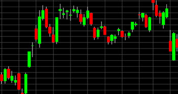 In the context of technical analysis, a chandlestick chart will typically be used to display data regarding opening price, highest price, lowest price and close price for a security during one trading day.
Instead of displaying this data in a single line (line chart), the candlestick chart lets a rectangle represent the area between the opening price and the close price. This rectangle is known as the body. If single lines exist at the top or at the bottom, they are called shadows, wicks or tails.
Technical analysts will often look at a sequence of candlesticks to spot patterns, e.g. candlesticks lined up representing 14 consecutive trading days.
The candlestick chart is believed to have been invented by Munehisa Homma, a trader of financial instruments based on the supply and demand of rice in 18th century Japan. Alternatively, it is a later invention dating to late 19th century Japan.
This article was last updated on: August 28, 2016