
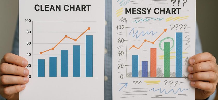
Understanding Clean vs. Messy Charts
In the realm of data visualization, using charts to present data plays a crucial role in effectively conveying information. The distinction between clean and messy charts can significantly impact an audience’s ability to interpret and make sense of the data being presented. Understanding the attributes that define clean and messy charts is essential to enhance data communication and ensure the clear transmission of information.
Characteristics of Clean Charts
Clean charts are meticulously designed to provide insights that are clear and easily understandable. They stand out due to several distinct features which contribute to their effectiveness:
Simplicity: Clean charts are often associated with a minimalist design approach. By eschewing unnecessary elements, these charts prevent viewer distraction and eliminate overwhelming experiences. The focus remains steadfastly on the data, unencumbered by extraneous details. This simplicity helps viewers concentrate on what truly matters.
Clarity: In clean charts, data is presented to allow swift comprehension. Essential data points are highlighted, and supplementary information that might obscure the primary message is kept at bay. This clarity in presentation ensures that the audience can quickly and accurately grasp the core insights.
Consistent Use of Colors: Colors in clean charts are used sparingly and with consistency. A limited palette not only makes these charts visually appealing but also ensures accessibility for individuals with color vision deficiencies. Consistent color usage aids in maintaining a coherent and easily interpretable visual narrative.
Legibility: Text elements, such as labels and titles in clean charts, are clear and readable. Typeface choices tend towards standard, easily legible fonts to ensure that all textual information can be comfortably read, thus enhancing the overall interpretability.
Effective Use of Space: The strategic use of white space in clean charts provides breathing room, reducing visual clutter. Proper spacing and alignment guide the viewer’s focus towards the data itself, facilitating effortless navigation through the chart’s components and improving comprehension.
Attributes of Messy Charts
Messy charts, on the other hand, often suffer from an overload of information and suboptimal design choices. Here are some common issues encountered with messy charts that impede the effective communication of data:
Overcrowding: Excessive data points or chart elements can make interpretation cumbersome. This data congestion leads to important insights being obscured by a flood of extraneous details, making it difficult for viewers to find what is crucial.
Color Misuse: The use of overly vibrant or numerous colors can confuse and mislead viewers. Inconsistent application of colors may inadvertently emphasize the wrong aspects of data, leading to incorrect interpretations.
Poor Labeling: Crowded or missing labels and legends can complicate efforts to understand what the data truly represents. Inadequate labeling forces audiences to guess or infer information based on inaccurate assumptions, diminishing the chart’s effectiveness.
Lack of Structure: Without proper alignment and spacing, messy charts tend to appear disorganized. This lack of structure detracts from the overall message of the chart, hindering the comprehension and communication of data insights.
Complexity: Complex charts filled with unnecessary visuals or 3D effects can obscure the genuine meaning of the data. Complexity that lacks purpose reduces the efficacy of the chart as a communication tool, cluttering the information rather than clarifying it.
Why Clean Charts are Preferable
Clean charts are generally favored for their ability to communicate data effectively. Their design principles prioritize clarity and accessibility, allowing audiences to readily grasp essential information without undue effort. By adhering to good design principles, clean charts ensure that data-driven insights are communicated accurately and efficiently. They help maintain the viewer’s focus on crucial data, encouraging informed decision-making and yielding better outcomes in data communication environments.
Improving Messy Charts
The process of transforming a messy chart into a clean one necessitates a focus on simplification. It is important to remove non-essential elements that contribute to clutter and confusion. This includes ensuring proper labeling with clear and concise text that aids understanding without overwhelming the audience.
Selecting a consistent color scheme is vital for reducing visual noise and ensuring that the audience can focus on the data itself, rather than being sidetracked by bright and inconsistent colors. An emphasis on simplicity not only enhances comprehension but also ensures that charts serve their primary purpose — effective communication of data insights.
In summary, clean and well-designed charts are indispensable tools for effectively communicating data. By emphasizing simplicity, clarity, and efficient use of design principles, the transformation of messy charts into clean ones becomes achievable. This transformation fosters better data understanding, thereby facilitating sound decision-making. It is crucial for anyone involved in data visualization to understand these principles, as they form the foundation for impactful and meaningful data representation.
This article was last updated on: September 18, 2026